Case Study · Afriex

Designing for cross-border
money movement

I joined Afriex after winning a design hackathon. Over three years as sole designer, I rebuilt every layer of the product that was making users hesitate; from first impression through post transfer confirmation, and built the systems that made that work replicable across multiple markets. Not by adding features, but by making every critical moment feel as reliable as the product actually was.

Company
Afriex
Role
Sole Product Designer
Duration
May 2022 – Sep 2025
Scope
iOS & Android · Admin tools · Business platform
Markets
Africa · Europe · UK · US · Canada
Origin

I didn't apply for this job. I won my way in. 🏆

Afriex ran a design hackathon. I entered, led the research, built the wireframes, and presented to the panel. My team won first place.

Months later, the CEO and Head of Product called. They'd been watching. The interview followed, and so did the contract.

What followed was three years of designing a fintech product that moved real money for real people across multiple countries: from broken flows to a full design system, from a consumer app to a business platform.
I wrote a LinkedIn post about it here
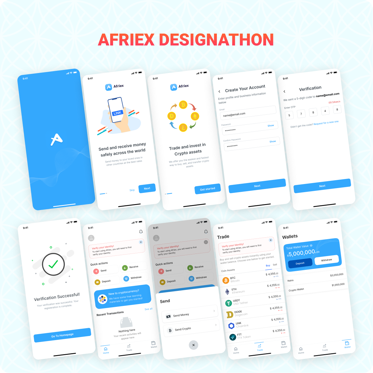
Afriex Designathon winning entry: onboarding, trade, and wallet screens
The problem

The product had traction. Trust was still being earned. 🤝

When I joined, Afriex had users and transactions. What it didn't have was a product that consistently made users feel certain at the moments that required certainty most. The interface was functional: signup worked, KYC ran, transfers completed. But every one of those moments left users with a question the product never answered.

User reality

Confident transactions weren't the norm

Completed transfers were generating support queries. Receipts confused rather than confirmed. Users were abandoning KYC mid flow, not because they couldn't verify, but because the flow made them afraid to continue.

Design gap

Functional, but not reassuring

Every critical moment (first impression, identity verification, transfer confirmation, post send receipt) left users with an open question the interface wasn't designed to answer. The product worked. It just didn't communicate that it worked.

Business pressure

Growth without a design foundation

Afriex was expanding across multiple markets, each with different identity requirements, different trust baselines, and different expectations of what a reliable product looks and feels like. One design had to work across all of them.

The reframe

This wasn't a feature problem

The question wasn't "how do we redesign screens?" It was: how do we reduce uncertainty at every stage of the user journey so people send money with confidence?

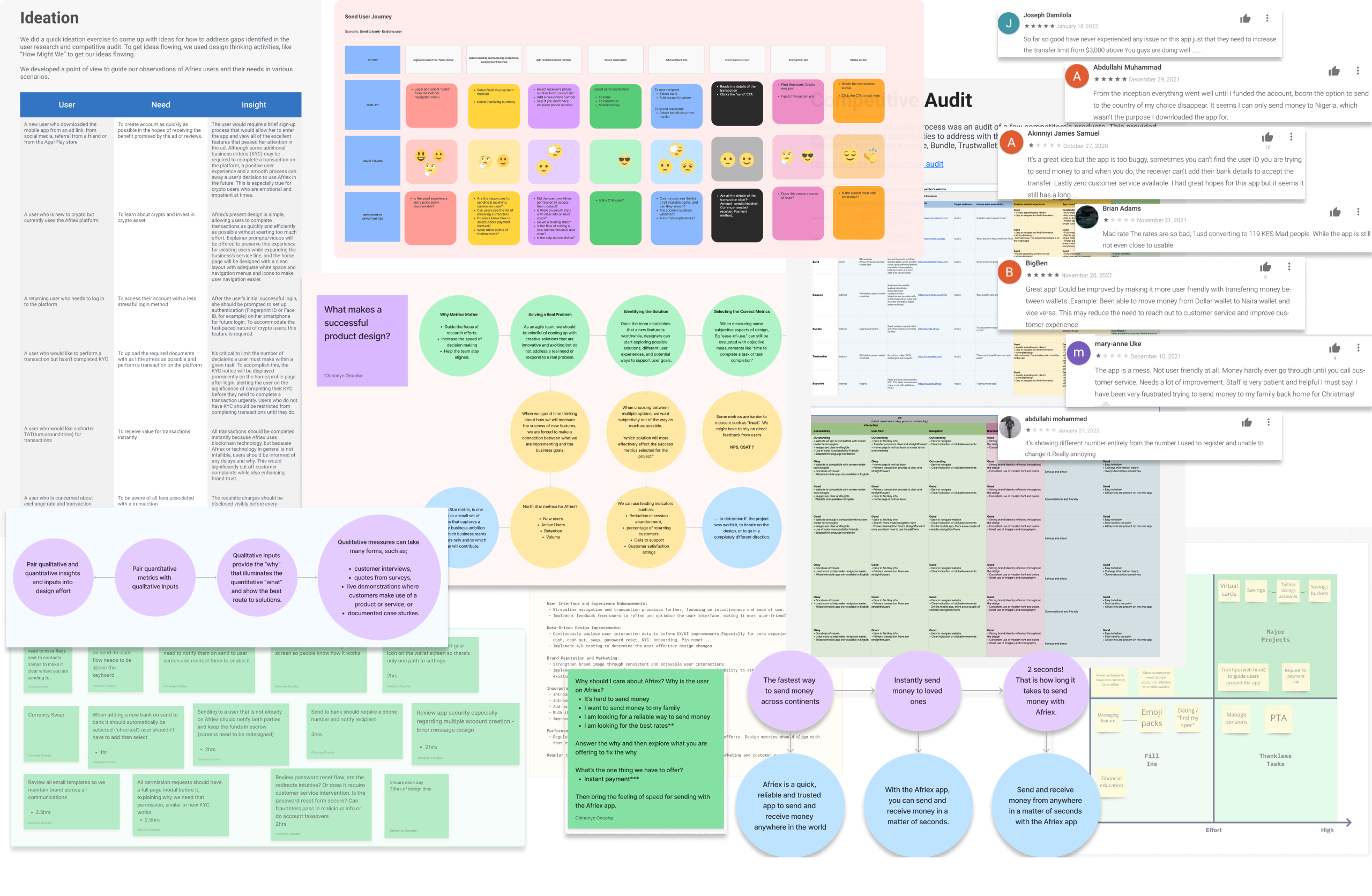
Research and audit board: ideation, send user journey mapping, competitive audit, and user reviews
Research & synthesis

Six markets. One core truth. 🌍

I conducted qualitative research across Nigeria, Ghana, Kenya, the UK, the US, and Canada. Different entry points, different contexts, but a consistent finding underneath it all: the product was functional, but not reassuring.

Competing with users' trust

Users were used to informal methods: cash, hawala, and bank wires. Afriex needed to build trust against these familiar options. The burden of proof sat in the design.

The issue was communication

Support volume stemmed from communication failures: ambiguous transfer status, unfinished verification flows, and unusable receipts. The product worked, but the interface didn't confirm it.

Trust builds in moments, not features

The insight that shaped every subsequent decision: trust builds through small certainties, not new features. Every redesign was assessed on one question. Does it increase user certainty or not?

Where I started
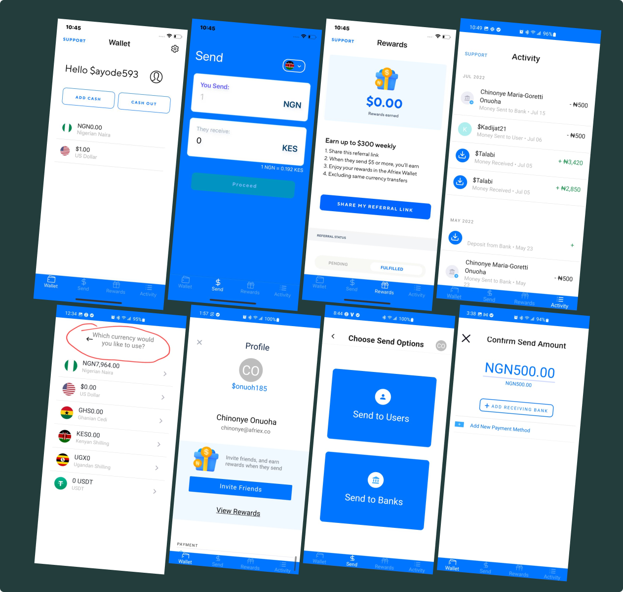
The Afriex app when I joined: wallet, send, rewards, and activity screens
Design evolution
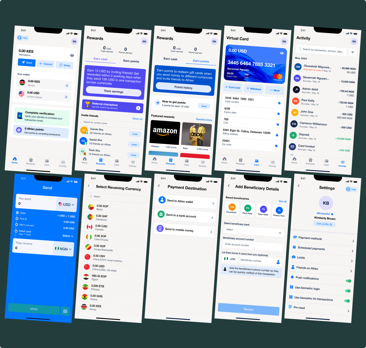
The redesigned Afriex app: home, rewards, virtual card, send flow, and settings
Strategic interventions

Not features. Decisions.

Every change I made was in service of a single question: does this make the product more trustworthy, more useful, or more sustainable? Here's how that played out across five areas.

Three years. A few things stuck. 🎯

Trust is built in layers

No single screen builds trust. It's the cumulative effect of consistency, feedback, and reliability across every interaction, every market, every edge case.

Systems outlive any single feature

The design system, QA process, and metric ownership had compounding returns. The less visible work that made everything else possible.

Sole designer means product thinker

Without a team, you sharpen fast. You learn to distinguish urgent from important. The hardest part was deciding which trust gaps cost us users and which we could accept. That discipline of triage is what I'd carry into any larger organisation.